There’s nothing worse than having to fill out a form that should take less than a minute but takes longer because they ask questions that aren’t relevant or there’s some ambiguous error you can’t find.
69% of users indicated that “excessive form field requirements” would deter them from completing a general inquiry form1
Here are seven tips you can apply to help improve online forms:
1. Cut the crap – only ask what’s required
If you don't require an address for the task required, then don’t ask users to provide one. People are more conscious of their personal information – both why it’s being collected and how it’s being used. Asking for unnecessary information will not only impact your conversion rate but, as outlined in the Australian Privacy Principle, you must not collect personal or sensitive information that is not reasonably necessary for the purpose of your activity.
65% of users stated they wouldn’t submit a form if “too much personal information” was required1
2. Group related information
If you're asking for different types of information, grouping related data into sets will make it much easier for users to complete and review the form. These should be grouped in a logical order and should also clearly indicate if parts of the form are mandatory or optional.

3. Remove placeholder text
Blank form fields tell the user where to fill in information. Using in-field placeholder text can make the form field look like it’s already been filled in and users might miss a field – this can lead to form errors and user frustration.
![]()
4. Make messages meaningful
Validation is important – it tells a user if they’ve entered something correctly or incorrectly. If an error has occurred, the user needs to know what they need to fix. Use both colour and a symbol to highlight where the user has made the error and provide a meaningful description. This will help the user quickly scan the form to find the error and update the information provided.
If a user has submitted a form correctly, a simple success message will stop them from wondering if it was actually sent or not.

5. Make it obvious and easy
The purpose of a form is to collect information – not for looking different because it’s ‘trendy’ or ‘stylish’. It’s important to create a visual hierarchy and have sufficient distinction between form elements to help users complete the task.
White form fields with a clear border are more recognisable than a coloured or stylised form. Don’t make it harder for users to work out where they need to click or tap to fill in a form.

6. Use field length as an affordance
Make your input fields the width of the anticipated data required. This creates a visual affordance and will help make it easier for users to complete your form.

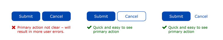
7. Make your primary action stand out
Your primary action button should be easy to find and should look like a ‘primary action’. Don’t make it hard for users to find how to submit the information you requested. Place your primary action button directly under the last input field a user fills in.
If there are two actions for the user, always prioritise the primary action over the secondary – making it quicker and easier for users to complete. For example, make ‘submit’ a button and ‘cancel’ a link.
In conclusion
The UX of forms will directly impact your conversion rate – you don’t want to lose people in a critical step. This was seen in an eCommerce example where a simple word change to a button increased purchases by 45% resulting in $300 million additional revenue in the first year2.
Contact the team at Raw Ideas and talk to our UX Designers for advice on improving your website and webforms.
Stat sources:
1 https://komarketing.com/files/b2b-web-usability-report-2015.pdf
2 https://articles.uie.com/three_hund_million_button/
 By
Ashleigh
By
Ashleigh


